 indiely
Guides · FIELD NOTES
How to Optimize Your Steam Capsule (2026)
Design Steam capsule art that still reads at 120 × 45 px: Valve's capsule rules, five common mistakes, and a simple thumbnail test before launch.
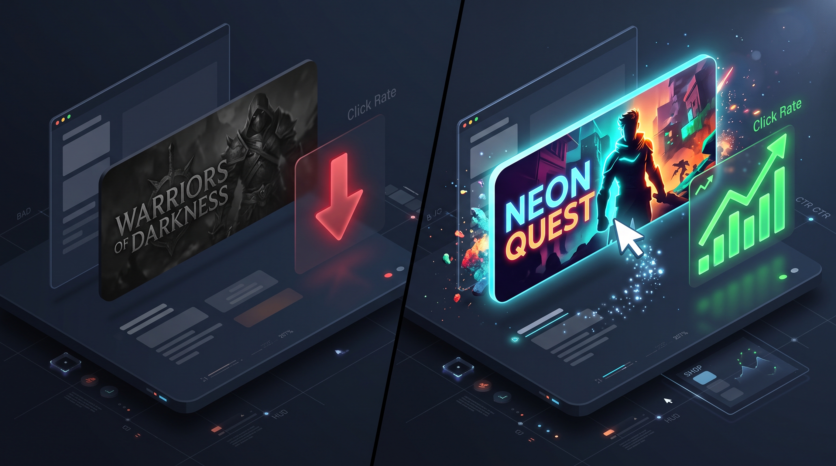
Your Steam capsule is usually the first thing a player sees, and most of the time they see it small: in search results, in "More like this" rows and in sale lists, surrounded by other games. A capsule that looks great as a full-size file can turn into an unreadable smudge at thumbnail size.
This guide focuses on that problem: how to design capsule art that still reads when Steam shrinks it, what Valve's rules allow, and how to test your capsule before it goes live.
Start with the right sizes (then design for the smallest one)
Steam requires four store capsules: header, small, main and vertical. Every current dimension, plus library assets and screenshots, is listed in our Steam capsule size guide, based on Valve's documentation.
The one to design around is the small capsule (462 × 174 px). Valve uses it in lists such as search results, top sellers and new releases, and automatically generates two even smaller versions from it: 184 × 69 px and 120 × 45 px (Valve: store graphical assets). If your capsule works at 120 × 45, it will work everywhere.
What Valve's rules allow on a capsule
Before you design, know the limits. Valve's graphical asset rules restrict base capsule artwork to game artwork, the game name and any official subtitle. That means:
- No review scores of any kind, including Steam reviews or press quotes.
- No award names, symbols or logos.
- No discount or sale copy.
- No calls to action, such as "Wishlist now."
- No other miscellaneous text.
If you want to announce an update, event or DLC on your capsule, Valve requires an artwork override: a temporary image limited to one month, localized into the languages your game supports, and describing content that is currently available.
5 capsule mistakes that hurt at small sizes
1. Dark art on a dark store
The Steam store uses dark blue-grey backgrounds. A moody, dark capsule can disappear completely next to them. You don't need bright colors, but you do need contrast at the edges and behind the logo. A subtle rim light or a lighter area behind the title is often enough.
2. A logo that's too small or too thin
Thin, decorative fonts and long titles break down first when the image shrinks. Valve's guidance is clear: the logo should nearly fill the small capsule. If your title is long, consider a stacked layout or a dedicated small-capsule composition rather than scaling down the header art.
3. Genre ambiguity
Players decide whether a game is "for them" before they read anything else. If your capsule could belong to three different genres, it does less work. Show one clear signal: a character in action for an action game, a cozy interior for a life sim, a map or units for strategy.
4. Visual clutter
Detailed key art with many characters, effects and background elements turns to noise at 184 × 69. Pick one focal point. Keep the logo and that focal point, and simplify or blur everything else.
5. Weak silhouette and contrast
Squint at your capsule. If the main shapes blend together, the capsule will look flat in a list. Strong silhouettes and a clear separation between foreground, logo and background survive scaling much better than fine detail.
The thumbnail test: check your capsule before launch
You don't need special software to catch most problems. Run these three checks:
- Shrink it. Export your small capsule at 120 × 45 px and view it at 100% zoom. Can you read the title? Can you tell the genre?
- Put it next to competitors. Place your capsule in a row with games from your genre on a dark background. The Steam Shelf Simulator does this for you with a realistic Steam layout.
- Ask strangers, not friends. Show two versions to people who have never seen your game and ask which one they would click and what genre they think it is. A free capsule A/B test collects those answers in a structured way.
If the answers surprise you, that's useful. It's much cheaper to change a capsule before a festival or launch than after.
Capsule checklist
- The logo is readable at 120 × 45 px and nearly fills the small capsule.
- The genre is clear from the image alone.
- There's one focal point, with clear contrast against Steam's dark backgrounds.
- There are no review scores, awards, discount text or calls to action on base capsules.
- Each capsule is composed for its own ratio, not stretched or blindly cropped.
- You've tested it next to competing games and with people who don't know the game.
Preparing for a festival? Your capsule is the first thing Next Fest visitors see. Our Steam Next Fest prep timeline shows when to finalize it.
Steam capsule FAQ
What size is the Steam small capsule?
The small capsule is 462 × 174 px. Steam automatically creates 184 × 69 px and 120 × 45 px versions from it, so the logo must stay readable at those sizes.
Can I put review scores or awards on my Steam capsule?
No. Valve's rules don't allow review scores, award names or logos, discount copy, calls to action or other text on base capsule artwork.
Can I change my capsule for an update or event?
Yes, with an artwork override. It's temporary (up to one month), must be localized, and can only describe content that's currently available.
Sources
More from the Journal
How to Write a Steam Short Description That Makes Players Scroll
Valve rules, a simple formula and before-and-after examples for writing a Steam short description that tells players what they will actually do.
Read the article
How to Choose Steam Tags for Your Indie Game (and Order Them Right)
How Steam tags work, how to choose and order your top 20, and how to check them against similar games. Based on Valve docs, with a worked example.
Read the article
How to Read Your Steamworks Traffic Report (Without Panicking)
A plain-English guide to the Steamworks traffic report: what impressions, visits and CTR really measure, and how to turn them into weekly decisions.
Read the article